
TRESS & BALANCE
- Oct 29, 2021
- 4 min read
Updated: Jul 21, 2025
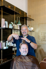
I have known my hair stylist, Mark Reyes, since about 2004. A Palm Springs native, he was introduced by a mutual friend shortly after we moved to the desert.
A few years after we met him, Mark moved to San Diego to work in a very good salon. He's so good that David and I frequently drove to San Diego for our haircuts, even after 15+ years, and we brought him back to Palm Springs for our wedding in 2008.
In early 2021, Mark texted to ask if I know any good designers in San Diego. In fact, I have several talented friends in the area, but naturally my response was, "Whyyyy....?"
(Actually, you may know that I am 'old school' and prefer phone calls to texts, so I immediately called him.)
Mark proceeded to tell me that he was, at last, opening his own salon in the very cool University Heights neighborhood. He had signed a lease on a tiny-but-mighty 450sf space in a building undergoing a complete renovation. His space was a raw concrete shell, and the entire salon concept needed to be created from scratch.
Naturally, I swooped in. Just as I rarely trust my hair to anyone else, you can be sure that I was going to take good care of my long-time friend and stylist. Faster than you can say highlights, Keith and I were on the road to San Diego.
My friends, I am thrilled to debut my first salon design -- Tress & Balance!

Lobby
We took advantage of the soaring ceilings and used a mural from Society6 to set the tone and color palette.
The salon is by appointment only, so most patrons will not have to wait. Nonetheless, we carved out space for two stools in the entrance area, which also features a hospitality station offering coffee, sparkling water, wine, and local microbrews.


Pictured Above:
The raw shell, our rendering/mood board showing the design, and the final result


Sources--
Wallpaper: Society6
Tile: Bedrosians
Floating Shelves: Ikea
Cabinetry: Custom by Christopher Kennedy Inc.
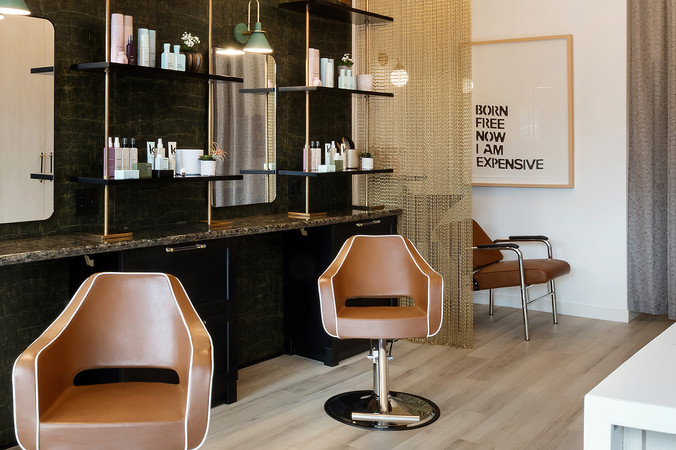
Styling Stations
The narrow space had very tall ceilings, so I made the space more intimate by building out the station wall by just a few inches to roughly match the eight-foot height of the storefront windows.
This change achieved several goals:
It humanized the scale.
It allowed us a natural place to start and stop the wallpaper that serves as the focal point of the styling stations.
It allowed us to completely re-jigger the electrical plan on that wall, making it work for our layout and the salon's needs (hair dryers, phone chargers, etc.) The landlord- supplied electrical outlets and j-boxes (seen in the image at left below) made no sense!
It allowed us to paint everything above the bump-out a bright white, so that ductwork and other utilities just fade into the background.


Hello, gorgeous!

The flooring is "luxury vinyl" which is affordable, waterproof, and totally durable. We added a soft layer of cork padding from Home Depot underneath the vinyl planks, to make it softer for the stylists standing on their feet all day.

Above: our detailed drawing of the salon styling wall.
Form, Function + Storage
True story: on our first visit, Keith Fortner and I asked Mark a zillion questions, as we tend to do with our clients. Where will you keep all the towels and robes? The color supplies? The back stock?
Sweet, talented, Mark sort of smiled and pointed and said, "I don't know, over there somewhere."
Remember, this space is just 450sf. There is no "over there somewhere."
We got you covered, Mark. We designed the space as you might a yacht, creating a wall of built-in cabinets that carved out a place for everything. Detailed CAD drawings by our team's talented architectural designer figured the spacing down to the inch and allowed our talented craftsmen to bring them to life.

To offset the price of the custom cabinets, which admittedly increased the budget, we used Ikea cabinets at the styling stations, which Mark assembled himself. Fabulous acrylic hardware from Emtek dresses up the Ikea cabinets and didn't break the bank.


The Washing Station
What's the first thing that happens when you get your haircut? They wash your hair!
Given the intimate scale of Tress & Balance salon, I wanted to give the hair wash process a little privacy. I added a beaded metal curtain to screen the hair wash station and a tell-tale piece of art from my friend Mat Sanders.
Jokes aside, this artwork is my reminder to my Mark that he is worthy, and worth it. I started my own business 20+ years ago, so I know the fun, crazy, wild ride that he is in for. On that journey -- in the minutiae of tax laws, payroll, credit card processing, and so much more -- it can be easy to forget your worth and even your passion. I know that many of us doubt our self-worth; it's something that I still struggle with at times, myself. This artwork doesn't mean you overcharge or take advantage. It means that you wake up every day, give it 110%, do a darn good job, and take care of your clients. You remember your worth and you do not settle. The energy you give out tends to be what you get back. Mark gives 100% good energy and I am so excited for his bright future at @tressandbalance


Cheers, Mark!
We wish you every success. Thank you for allowing us to be part of your dream come true.
XO
CK


Photography: Public 311 Design
luckywin.poker bữa lướt thấy mấy đứa bạn nói qua nên mình bấm vào xem thử cho biết thôi. Vào cái là thấy trang load cũng nhanh, kéo trên điện thoại không bị giật hay lệch chữ gì nhiều. Mình không rảnh ngồi khám phá trò này trò kia, chủ yếu đọc phần giới thiệu thì thấy họ có nhắc tới mấy thứ bảo mật kiểu SSL với OTP nên cảm giác đỡ lo hơn chút. Cách họ trình bày cũng dễ chịu, kiểu chia từng khối nội dung, tiêu đề to nên lướt xuống là biết đang ở đoạn nào. Menu đặt ngay trên, bấm qua lại mượt, với mấy ô FAQ nhìn gọn, chữ rõ trên nền sáng.
88clb mình lướt thử vì thấy bạn bè nhắc hoài, kiểu vào xem cho biết chứ không định đào sâu. Cảm giác đầu tiên là trang nhìn khá thoáng, các mục được chia rõ nên không bị lạc, kéo xuống là thấy nội dung theo từng khối gọn gàng. Mình để ý họ có nhắc chuyện nên tỉnh táo trước mấy trang giả mạo, đọc cũng hợp lý vì dạo này nhiều chỗ làm giống nhau quá. Với lại tiêu đề bài viết liên quan World Cup 2026 được đặt nổi bật nên ai quan tâm bóng đá chắc tìm nhanh. Nói chung thao tác qua lại giữa các mục không phải mò mẫm nhiều, vì menu và các khối…
hm88 dạo này thấy nhiều người nhắc nên mình cũng ghé thử cho biết. Vào trang cái là thấy họ chia nội dung theo kiểu từng khối rõ ràng, nhìn lướt phát biết mình đang ở mục nào, không bị ngợp chữ. Mình tò mò nhất phần Câu hỏi thường gặp nên bấm đọc, thấy họ trả lời khá trực diện: có nói chuyện đôi khi link bị chặn là do nhà mạng, rồi bảo sẽ cập nhật link dự phòng để đỡ bị gián đoạn. Mình không kiểm chứng được vụ đó, nhưng cách họ viết kiểu hỏi–đáp ngắn gọn nên đọc nhanh hiểu luôn, khỏi phải đi tìm lung tung. Nói chung trải nghiệm xem qua khá dễ…
UU88 mình mới ghé thử cho biết vì thấy nhiều người nói, chứ cũng không kỳ vọng gì nhiều. Vào cái là thấy giao diện nhìn khá “sạch”, tông màu dịu nên ngồi lướt một lúc không bị chói mắt. Mình thích kiểu họ chia nội dung thành từng khối rõ ràng, kéo xuống là biết đang ở phần nào, không phải mò mẫm. Có đoạn nói về giấy phép độ hợp pháp để khá dễ thấy, đọc lướt cũng hiểu họ muốn người dùng yên tâm hơn. Mình chỉ bấm qua vài mục thôi nhưng cảm giác chuyển trang mượt, không bị rối hay lạc hướng. Nói chung cái bố cục trực quan với các chuyên mục sắp xếp…
https://o8na.jp.net/ dạo này thấy nhắc hoài nên mình cũng bấm vào xem thử cho biết. Mình không đọc sâu lắm, chỉ lướt nhanh để xem bố cục và cách họ trình bày. Cảm giác đầu tiên là trang sắp xếp khá “ngăn nắp”, từng phần tách riêng nên nhìn phát hiểu ngay đang ở mục nào. Các khối nội dung và kiểu hiển thị dạng cột/bảng nhìn gọn, chữ dễ theo dõi, không bị rối mắt. Thanh menu đặt chỗ ổn, chuyển qua lại giữa các mục cũng nhanh, không phải tìm kiếm lòng vòng.