
Sedona Project: Kitchen & Dining Room
- Jun 27, 2025
- 2 min read
Updated: Mar 19
The tour of our Sedona, Arizona project with a tour of the home's kitchen and dining room.
We were brought in to help design this home during the early phases of construction. Working closely with the client, we selected all the finishes and hard surfaces for this gorgeous ground-up building project.
The home itself is about 3500sf, with three bedrooms and 3.5 bathrooms, an office, and a gym.
It has breathtaking views of the surrounding Sedona landscape.

Above: the front exterior
Setting the Stage: The Exterior
The structure itself is modern, with various materials on the outside creating texture and visual interest. The home and roof are intentionally kept a dark color to blend into the surrounding landscape.

Our client, who formerly had a home in Palm Springs, wanted to keep the vibe fun and site specific, but avoid any Sedona cliches.

The Big Picture
This new construction home was designed with the popular "open floor plan" where the kitchen is open to the dining room and main living room.

We created multiple seating options for maximum flexibility, including a dining table for six, casual counter height seating, and table height seating as an extension of the kitchen island -- which is where our client and her son enjoy most of their meals together.

The Dining Room

The Dining Room is defined visually be a dramatic light fixture from Apparatus Studio. The pendants add a dramatic focal point without blocking any views or sight lines.
A Saarinen-inspired table from Julian Chichester adds a midcentury note to the overall contemporary vibe. The oval shape allows for easy circulation between the kitchen and living room. The custom chairs are from Berman Rosetti.
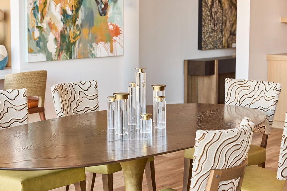
The fabric on the back of the chairs is reminiscent of topographical lines on a map, and references the beautiful Sedona terrain outside.
The Kitchen

The kitchen is light and bright, with white oak cabinetry and white quartz countertops. The island cabinetry is a contrasting color.
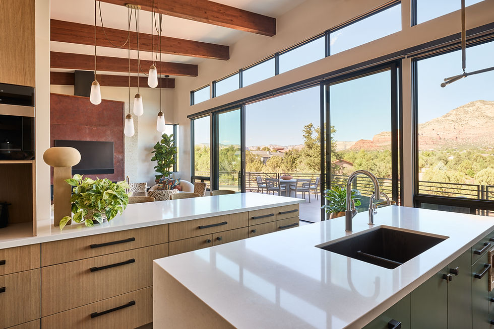
The natural stone backsplash brings together the color story of the entire home, with tones of deep orange, rust, green and blue --- all hues inspired by the Sedona landscape outside.


The kitchen includes a desk for bill paying, laptop charging, and organization. An "Arrow" light fixture defines the built-in table seating at the kitchen island
All About the Details


I hope you enjoyed this tour!
xo
CK
Sources-
Builder: Cavanaugh Construction
Photography by: John Woodcock
Styling and flowers: Keith Fortner
U888 .com dạo này mình thấy nhiều người nhắc nên tò mò bấm vào thử cho biết thôi. Mình không có soi kỹ nội dung hay chơi gì cả, chủ yếu nhìn qua cách họ làm giao diện. Cảm giác đầu tiên là trang chia mục khá rõ ràng, nhìn một cái là biết mình đang ở đâu chứ không bị “ngập” chữ. Mấy phần thông tin hiển thị theo dạng khối cột gọn gàng nên lướt trên điện thoại cũng đỡ rối, không phải kéo qua kéo lại nhiều. Mình cũng thích kiểu menu đặt dễ thấy, bấm chuyển mục khá mượt, không phải tìm vòng vòng. Nói chung nhìn qua thấy ổn áp, nhất là cách họ sắp…
I discovered this article while reading about managing menopause symptoms naturally and medically. The piece https://ways2well.com/blog/what-kind-of-doctor-prescribes-hormone-replacement-therapy caught my eye because it explains who can safely prescribe HRT and how they monitor therapy. I appreciated the detailed explanation about the evaluation process and follow-up care. It gave me peace of mind knowing there’s a structured approach to treatment.
NET88 CASINO mình thấy bạn bè nhắc hoài nên cũng ghé thử cho biết, chủ yếu xem giao diện có dễ nhìn không thôi. Vào trang cái là thấy bố cục khá thoáng, chữ không bị dồn và các phần tách ra rõ ràng nên lướt nhanh vẫn hiểu mình đang ở đâu. Mình thích kiểu họ để mấy thông tin kiểu bảo mật minh bạch thành từng khung riêng, nhìn như box nên đọc qua cũng nắm ý, không phải kéo lên kéo xuống tìm. Menu đặt chỗ dễ thấy, bấm qua lại giữa các mục cũng mượt, không bị rối hay phải đoán nút nằm đâu. Nói chung cảm giác làm gọn gàng, ưu tiên người dùng. Nhìn…
bet88 đăng nhập mình thấy khá dễ tìm ngay khi vừa vào trang, kiểu đặt ở góc trên nên liếc cái là thấy liền. Bấm vào thì nó hiện khung điền tài khoản với mật khẩu gọn gàng, không bị nhồi nhiều thứ nên đỡ rối mắt. Mình thích mấy site làm form đơn giản vậy, nhập xong là vào nhanh, còn lỡ quên thì thường có chỗ xử lý lại ngay trong khu đó nên cũng yên tâm. Nói chung mình không mò sâu, chỉ để ý cách họ sắp xếp cho người mới khỏi bối rối thôi. Điểm mình thấy ổn là phần đăng nhập nằm sát khu menu chính nên chuyển qua lại các mục trên giao…
alo8.xyz mình mới ghé thử vì thấy vài người nhắc, kiểu tò mò xem giao diện họ làm thế nào thôi. Mình không đọc kỹ nội dung, chủ yếu lướt qua cách họ chia mục và sắp xếp thông tin trên trang. Cảm giác đầu tiên là bố cục khá thoáng, nhìn vào không bị ngợp, các khối nội dung tách ra rõ nên kéo xuống cũng dễ theo dõi. Cái mình thích là menu để ngay chỗ dễ thấy, bấm qua lại giữa các phần không phải tìm nhiều. Nói chung mình chỉ cần vậy để nắm nhanh trang có gì, không mất công mò mẫm. Nhìn tổng thể thì phần tiêu đề và các khung nội dung trên…