
The Dapper Du Bois: Kitchen
PROJECT REVEAL
KEITH'S DAPPER HOME
Last time, I sat down with Keith for cocktails at his sunken bar for the Great Room reveal. Right before last call, he mentioned that Todd, a great cook, was ready to get that new Bertazzoni range cranking out some delicious food.
I took that as an invitation. (It was not an invitation.)
So tonight, I invited myself over and pulled up a stool at the peninsula, Todd took his place at the range, and Keith walked me through the most dramatic transformation in The Dapper Du Bois: the kitchen. It was designed with Joseph DeCasperis of The High End. Kitchen & Home, dressed head to toe in Thibaut, lit by Hudson Valley Lighting Group, and powered by Bertazzoni.

Pull up a stool. Read on as I ask Keith to dish on every detail...
CK: Let's start with the Before. Be honest. What were we working with?
KF: A kitchen that had been updated once, a long time ago, and never again. Whitewashed laminate cabinets with long metal bar pulls, gray laminate countertops, white square tile on the floor, and butter-yellow walls. The refrigerator was a side-by-side that stuck out like a sore thumb, and the ovens were stacked in a tall cabinet in the corner
CK: I hear that butter yellow is very in right now.
KF: Then someone else can have it. For me, the best place for butter is on popcorn.

CK: And the track lighting?
KF: Don't get me started on the track lighting. It was on track to nowhere.
CK: (Slow Clap) You've be saving that one.
KF: Since March.


CK: What were the must-haves?
KF: For me, it's about a kitchen that feels like another beautiful room in the home, not a utility room. It opens right into the breakfast room, so it had to be warm and layered. For Todd, a serious range. He is the cook in this house. I'm more of the...
CK: Supervisor? (Sideways glance from Todd...)
KF: Curator.
CK: That tracks. And the must-go's?
KF: All of it. (Pause) Ok, the window could stay. (Todd rolls his eyes)
Enter The High End
CK: You brought in Joseph DeCasperis of The High End to design the kitchen. Why Joseph?
KF: You and I had met Joseph at numerous industry. We like his energy and admired his work from afar, but never had the chance to collaborate. This seemed like the perfect opportunity to get to know each other better.
CK: What was it like being the design client? What sort of brief did you give him?
KF: I knew how I wanted it to feel. But you and I don't cook, as everyone knows. Joseph knows how to make a kitchen actually work: where every drawer goes, what goes in it, and how two people be in the same room without a single elbow incident.
CK: Two people, not getting in each other's way. That's one of the secrets to a good relationship -- and a good kitchen.
KF: That, and lots of drawers.
CK: Tell us about the first renderings.
KF: Joseph's first presentation was literally titled "Designed for Keith and Todd," which, I'll admit, I loved. It was fun being the client, for once.
But then, right under that, in big letters, it said "Completely Reconfigured Layout."
CK: Dollar signs!
KF: Yep. I was nervous, but he was right. Nothing in here is where it used to be. But it feels just like it should, and it was so worth it.

CK: I read the whole presentation, cover to cover. There's a callout for a "sneaky drawer." What is a sneaky drawer, and why don't I have one?
KF: It's a shallow drawer hiding on top of a deeper one. For example, you might have Tupperware lids living in a shallow drawer, with their corresponding containers in the deeper drawer below.
CK: I need to incorporate those in my own kitchen remodel.
KF: There's also a pantry with rollouts, a corner pullout, a divider for cutting boards and cookie sheets, and a beautiful cabinet with pocket doors that makes the perfect appliance garage -- but it feels like an armoire. I love it.
CK: You got your wish for cabinetry that feels like furniture.
KF: I sure did.

Above: The concept called for a 48-inch paneled refrigerator, a pantry with rollouts, and a glass cabinet with a thin metal-framed door. All three made the final cut.
CK: How close is the finished kitchen to the renderings?
KF: The bones are all there: the concealed hood with push-to-open cabinets on either side, the 48-inch paneled refrigerator, the paneled dishwasher, the glass cabinet with the slim metal door. Joseph gave us the architecture. Then we dressed it: the fabrics, the ceiling, the lighting, the island.
CK: My favorite note in the whole presentation is this one: "Consider unique lighting right of window."
KF: We considered it. (Knowing smile and a glance towards the window)
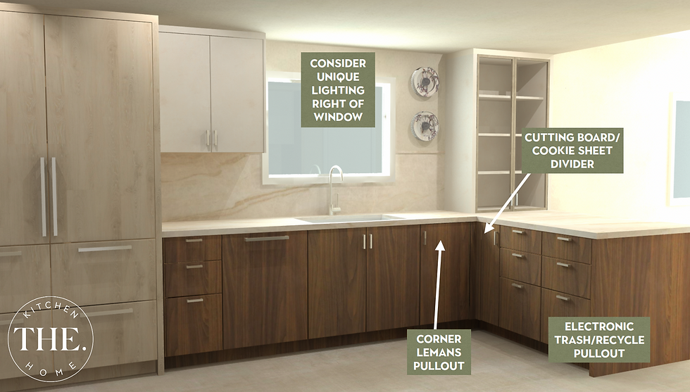
Above: Above: Joseph's concept, with the "consider unique lighting" note.

Above: The finished kitchen, with the Thira wall sconce by Corbett Lighting, to the right of the window, just as Joseph envisioned.
CK: I'd say you more than considered it.

The Kitchen: After
CK: Okay, walk me through it. I count three cabinet finishes. Wow.
KF: You counted correctly. Walnut on the base cabinets - for just enough of midcentury nod. A light oak on the tall wall with the refrigerator and pantry, to keep things light and fresh. Finally, a plater-look finish on the uppers and around the hood, for a modern look.
With three finishes, no matter what is trending -- light wood, dark wood, etc -- I figure at least part of my kitchen will always be in style!
CK: So, three shades of neutral.
KF: Three finishes.
CK: Brown, beige, and café au lait.
KF: Walnut, oak and plaster. It's called texture and interest. And I thought we retired that joke.
CK: We did. It's back for one night only.
KF: Like Cher.
CK: Like Cher. (Raises glass.)

Above and Below: The walnut and plaster finishes of the cabinetry, with two-toned nickel and copper knurled pulls from Emtek.

CK: And the counters?
KF: Caesarstone, with a soft, warm vein, and it runs right up the wall behind the sink and the range as a full-height backsplash. Same idea as the bar: practical, and it looks like it was always meant to be here.
CK: Now, this island. Let's talk about it.
KF: The floor space of this kitchen is a bit too small to add a true cabinetry-grade island, but too big to leave empty. It's actually a piece of furniture from Palecek. It's a great drop station when we bring in groceries, and it suits the space perfectly. The rounded corners make it super easy to navigate around.
CK: It's sublime. And the pears? I have known you for 14 years, and I have never seen you eat a pear. (Todd nods in subtle agreement)
KF: Just consider the pears to be load bearing. Please don't touch the pears. Next question.

Now We're Cooking
CK: Let's talk appliances, because Todd has been glaring at me from behind that range since I sat down.
KF: Everything is Bertazzoni. Todd has wanted a proper range forever, and this one is the star of the room.
CK: Italian, gorgeous, and does all the hard work. That's my type, too.
KF: We know.

Above: The range alcove, which brings together all three wood finishes. CSL's Acrobat recessed downlight provides overhead lighting.
CK: Wait. Joseph's rendering says 36-inch range. That is not a 36-inch range.
KF: Todd had notes. We decided to go bigger and get the 48" range.

Above: Joseph's concept rendering.
Below: The Bertazzoni range that actually moved in.

CK: And where's the hood?
KF: Hidden. It's tucked up into the with push-to-open cabinets on either side. You get all the power, extra storage, and none of the... hood.
CK: Very discreet. Unlike me.
KF: Unlike you.
CK: And where is the refrigerator, again? I thought that whole oak wall was a pantry.
KF: Half of it is. The other half is a 48-inch paneled refrigerator. The dishwasher is paneled too, so the only appliance that gets to show off is the range.
CK: As it should be. The diva gets the spotlight.

Above: A beautiful wall of oak wall hides a 48-inch paneled refrigerator and freezer, with a pantry to its left.
Below: The Bertazzoni dishwasher disappears into the walnut cabinetry.

Let There Be (Beautiful) Light
CK: Now my favorite subject: the lighting. Every fixture in here is from the Hudson Valley Lighting Group family, decorative and architectural.
KF: Every single one. Let's start at the sink, since that's where everyone starts.
CK: That incredible stone sconce.

KF: It's the Thira wall sconce by Corbett Lighting. I needed both art and light at the kitchen sink, and Thira delivers both. It's a translucent alabaster bowl cradled by a slender arm, and the rich bronze finish echoes the dark wood of the base cabinets. The backplate is concealed, so it appears to float on the wall.
CK: It was one of the first things I noticed when I walked in.
KF: It's the first thing everyone notices. Then they notice the faucet.
CK: Speaking of. Do I spy another Brizo? And is that their Frank Lloyd Wright Collection? You do know the way to my heart...
KF: I thought you would like that. Yes, it is part of their Frank Lloyd Wright Collection. It's in a polished nickel finish with wood inset into the handle.
CK: We do love us some Brizo.
KF: You've said that on the record twice now. They're going to put it on a billboard.

CK: And what are these fabulous lights over the peninsula? To be honest, I didn't expect that you could fit a decorative light on the bottom of the dropped soffit..
KF: Luxe Cylinders by CSL, with an alabaster bezel that softens the glow. They pool light right onto the counter. I love them because they are "architectural" lights that are also decorative.
CK: They look fantastic. During our last happy hour, when we were sitting in your bar, I commented that I might have to stop saying designers hate can lights.
KF: And?
CK: I've stopped. These aren't cans. They're fucntional jewelry for the ceiling.

Above: CSL Luxe Cylinders over the peninsula, lights on, showing their alabaster bezel.
The Breakfast Room
CK: Come sit with me at the breakfast table. It's vintage travertine, if I am not mistaken. This room is so sumptuous. And this chandelier!
KF: It's the Mailo chandelier by Troy Lighting. It's inspired by vintage furniture: a white oak frame, Patina Brass accents and white linen shades. The oak and brass are the perfect complement to the rich brown and cream of the Thibaut drapes and the vintage travertine table.

CK: Vintage-inspired, warm, with a little brass. It's basically your personality in light fixture form.
KF: I'll take that as a compliment.
CK: Sure.

Above: The Mailo chandelier by Troy Lighting over a vintage travertine table.
CK: And that buffet looks just like Joseph's drawings.
KF: It is. We made the cabinets a bit shallow, so it doesn't eat into the room. We distinguised this area by making the countertop extra thick and adding a thin shaker frame to the walnut cabinets, which the rest of the kitchen doesn't have.
In these floor plans, alot of people take out the wall above cabinetry, to "open it up" to the dining room on the other side. But I like the separation and the focal point this wall creates.
CK: Me too. My favorite part is the oak "proscenium arch" that frames the alcove; the same detail as frames the range alcove. The proscenium is a sutble reference to your background in theatre.
KF: Exactly. Joseph nailed it.

CK: And the lamp on the buffet? I love the glow. I bet we look fabulous in here.
KF: We do. It's the Brice table lamp by Hudson Valley Lighting, designed by Augusta Hoffman. It has a white oak base and a sculptural handmade paper shade that really anchors the built-in buffet, and the polished nickel buttons on the sides add punctuation that mimics the leaning art.
CK: Little buttons! I want to poke them.
KF: Please don't.
Thibaut, Top to Bottom

CK: Let's talk Thibaut, because I count at least three of their fabrics and wallpapers in this room alone.
KF: All the fabrics and wallpapers are Thibaut.
CK: I love that you repeated the same fabric on the roman shade as the drapes. I tend to go for the mix, but there is something to be said for consistency.
KF: Classic decorating - you know I'm a fan. It ties the kitchen and the breakfast room together, so they read as one room. Your eye goes from the sink straight through to the breakfast table, and beyond to the covered patio.
CK: The sheers are sumptuous. Who has sheers and drapes in their kitchen?
KF: Well, Todd and I do.

CK: You wallpapered the ceiling. In a kitchen. With a natural fiber material.
KF: Todd is a very neat cook. And - the ceiling is the fifth wall. You taught me that.
CK: I did teach you that. I just didn't think you were listening.
KF: I was listening. I was also rolling my eyes.

Resources:
Kitchen Design: Joseph DeCasperis of The High End Kitchen & Bath
Photography: Public 311 Design
Interior Design: Keith Fortner
Take the Full Tour:


Comments